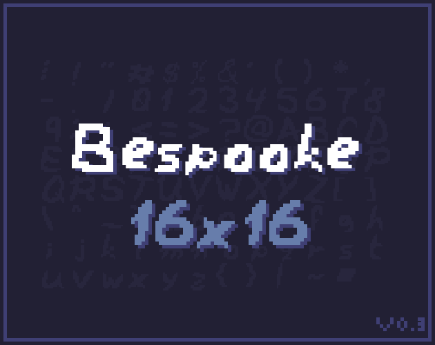
Bespooke - Cute Spooky Pixel Font 16x16
KERNING! And such!
Minor Update 03/05/25
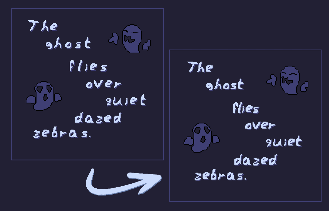
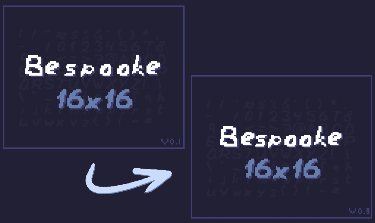
Kerning
Kerning (aka horizontal spacing between letters) has been greatly improved. Fixed issues with certain glyphs overlapping or having otherwise improper spacing. Here are some snippets on the improvements from V0.1:
Added "+" glyph
Thanks to the friend who pointed this out while we were messing around with this font! You know who you are. And now the rest of the Internet gets the gift of addition!
Leave a comment
Log in with itch.io to leave a comment.